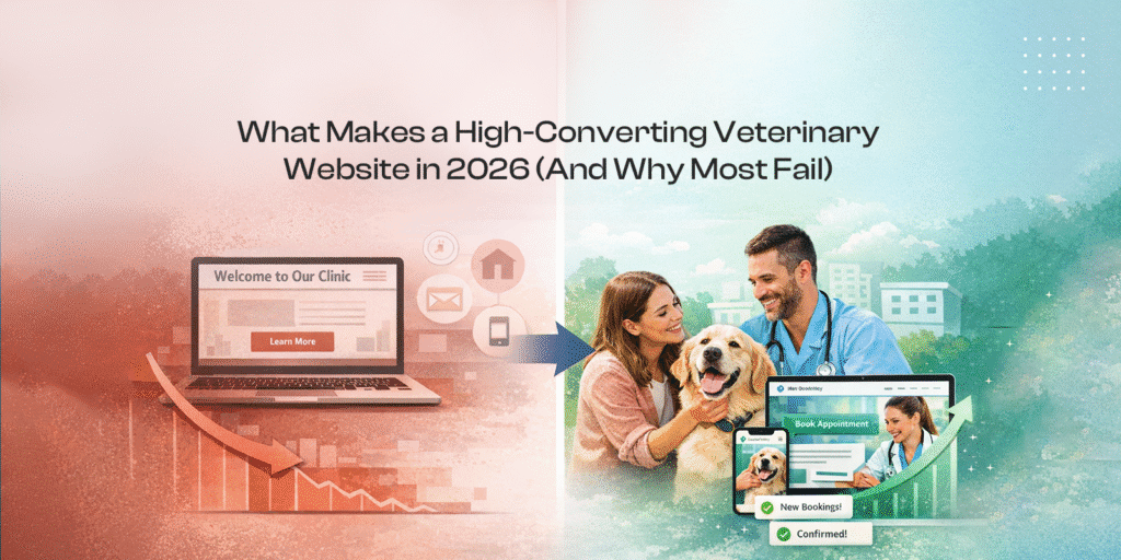
Most veterinary websites look professional.
They have clean layouts. Nice images. A list of services.
And still, they don’t generate appointments.
That’s the problem.
Most clinics are running websites that function like brochures. They inform, but they don’t convert. They sit online instead of actively bringing in new clients.
In 2026, that’s no longer acceptable.
A veterinary website, like those built by Digital Vet Suite, should guide a pet owner from search to booking with as little friction as possible.
This guide breaks down exactly how to do that.
Why Most Veterinary Websites Fail to Convert
The issue is not design quality. It’s intent.
Most sites are built to “look good,” not to drive action.
Here’s what typically goes wrong:
- No clear call-to-action above the fold
- Booking requires calling during business hours
- Forms are long, slow, or confusing
- No strong trust signals
- Poor mobile experience
A pet owner lands on your site with urgency. Their dog is sick. Their cat needs a checkup. If the next step is not obvious, they leave.
They don’t try harder. They go to the next clinic.
That’s the reality.
A high-converting veterinary website is not about creativity. It’s about removing friction.
The 5-Part Veterinary Website Conversion Framework
Instead of thinking in pages, think in systems.
Every high-performing veterinary website follows five core elements.
1. Trust
Before someone books, they need confidence.
That comes from:
- Reviews and ratings
- Real photos of your clinic
- Credentials and experience
- Clear branding
Stock images destroy trust. Real visuals build it.
2. Clarity
Visitors should instantly understand:
- What you do
- Who you serve
- What problems you solve
Avoid vague messaging like “quality care for your pets.”
Be specific:
“Same-day appointments for dogs and cats in [City].”
3. Urgency
Pet care is often time-sensitive.
Your site should reflect that:
- Emergency messaging
- “Book today” prompts
- Availability indicators
Without urgency, people delay. With urgency, they act.
4. Friction Removal
This is where most websites fail.
Reduce effort at every step:
- 1–2 click booking
- Minimal form fields
- Clear navigation
If booking feels like work, conversion drops.
5. Follow-Up
Conversion doesn’t end at booking.
You need:
- Appointment reminders
- Follow-up messages
- Rebooking prompts
This increases lifetime value, not just initial visits.
Homepage Structure That Drives Appointments
Your homepage is not decoration. It’s a funnel.
Here’s what actually works.
Above the Fold
This is the most important section.
It should include:
- Clear headline (what you do + location)
- Primary CTA: “Book Appointment”
- Phone number (visible, clickable)
No sliders. No clutter. No confusion.
Trust Section
Immediately after the hero:
- Google reviews
- Testimonials
- “Trusted by X pet owners”
People scan for validation before taking action.
Services Overview
List your core services:
- Vaccinations
- Emergency care
- Dental
- Surgery
Keep it simple. Link to deeper pages.
Repeated CTAs
Do not rely on one button.
Place booking CTAs:
- After each section
- In a sticky header (especially on mobile)
Make action unavoidable.
Booking Integration Is the Real Conversion Driver
This is where the biggest gains happen.
Most clinics still rely on phone calls.
That’s inefficient.
People don’t want to call. They want to book instantly.
Why Phone-Only Systems Fail
- Limited to business hours
- Creates delay
- High drop-off rate
If someone lands at 9 PM and can’t book, you lose them.
What a High-Converting Booking System Looks Like
- Real-time availability
- Mobile-friendly interface
- Instant confirmation
- Minimal steps
Time to book should be under 30 seconds.
Anything longer reduces conversion.
The Competitive Edge: Virtual Consultations
This is where forward-thinking clinics win.
Offer:
- Online consultations
- After-hours availability
- Quick triage appointments
This expands your capacity without expanding your physical space.
Mobile-First UX: Where Most Clinics Lose Clients
Most traffic is mobile.
But most websites are still designed for desktop.
That mismatch kills conversions.
Common Mobile Problems
- Buttons too small
- Slow loading speed
- Hard-to-find booking options
- Cluttered layouts
If a user struggles for even a few seconds, they leave.
Mobile Optimization Checklist
- Large, thumb-friendly buttons
- Sticky “Book Now” CTA
- Load time under 3 seconds
- Simple navigation
Mobile is not a secondary experience. It’s the primary one.
SEO That Actually Brings New Pet Owners
SEO is not about traffic. It’s about qualified traffic.
You don’t need more visitors. You need the right visitors. Effective SEO for vets ensures you reach local pet owners at the moment of need.
Local Search Intent
Most clients search like this:
- “Vet near me”
- “Emergency vet in [city]”
Your site should align with that intent.Utilizing Google Business Profile is essential for ranking in these local searches.
Service Pages That Rank
Create dedicated pages for:
- Vaccinations
- Dental care
- Emergency services
Each page should target a specific search query.
Content That Converts
Blogs should not exist for volume.
They should answer real questions:
- When should I vaccinate my dog?
- What to do in a pet emergency?
This builds trust before the first visit.
Common Veterinary Website Mistakes That Kill Conversions
These are everywhere.
- Too many pages → confusion
- Hidden pricing → hesitation
- Generic messaging → no differentiation
- No clear CTA → no action
- Slow loading → high bounce
More features don’t improve performance.
Better structure does.
Before vs After: What Actually Improves Results
Before:
- No online booking
- Generic homepage
- No trust signals
- Poor mobile experience
After:
- Clear, visible CTA
- Integrated booking system
- Mobile-first design
- Strong reviews and proof
The difference is not subtle.
It’s measurable in appointments.
The Future of Veterinary Websites in 2026
The shift is already happening.
Clinics that adapt will grow. Others will fall behind.
What’s Changing
- Virtual consultations becoming standard
- AI-assisted booking and chat
- Online-first client journeys
Clients expect convenience.
If your website doesn’t provide it, they will choose one that does.
How to Turn Your Website Into an Appointment Engine
It comes down to a few principles:
- Prioritize conversion over design
- Remove every point of friction
- Make booking immediate
- Build for mobile first
- Integrate systems, not just pages
A high-converting veterinary website is not complicated.
But it is intentional.
Get a Free Veterinary Website Audit
If your website is not generating consistent appointments, there’s a reason.
We’ll identify:
- Where users drop off
- What’s blocking conversions
- How your booking system can improve
- SEO opportunities to bring in more local clients
Get a Free Veterinary Website Audit
FAQs
What is the best design for a veterinary website?
A clean, mobile-first design focused on fast booking, clear messaging, and strong trust signals.
How do veterinary websites get more clients?
Through a combination of local SEO, conversion-focused UX, and seamless booking systems.
Do vets need online booking?
Yes. It significantly increases appointment rates and reduces drop-offs.
How much does a veterinary website cost?
Costs vary depending on features, but high-converting sites typically include booking systems, SEO structure, and mobile optimization.
If your website is not driving appointments, it’s not doing its job.
Fix the system, and the results follow.